Thursday, February 28, 2013

February 28:: P2 Progress

I've done some more looking into 'Serenity' and 'Serendipity', along with color pallettes/colors/animals associated with the words. I've also went and downloaded some Modern-looking Open Type fonts to experiment with for the logo. I'm leaning towards using Green & Brown for the color scheme, with a bit of teal thrown in from the Kingfisher's colors.

Possible Names:
Serendipity
Serenity

Open-Type Fonts Gathered:
Raleway
Quicksand
Advent Pro

Animals Associated:
Kingfisher
Loon


Colors Associated:
Blue - Serenity
Green & Brown- Nature/natural, longevity

Color Palettes: (Probably won't use, was just looking)


February 28: Ideas & Critique Comments

So far, I've settled on the name 'Serendipity' for 'FSX'. It's a tad long, so I'm also considering possibly using 'Serenity', which has a similar connotative meaning to Serendipity.

During Critique, I had a few thumbnail sketches that I'll post below.

       
It was a unanimous comment that the word chosen for the name was well liked. However, it was also agreed that my representation of the logo was much too flowery to be 'modern' which I agree with as I tend to make my designs over-decorative.

Another thing that I was considering when sketching logo designs, is I wasn't sure if it should be JUST the text, or if it should have a pictoral aspect of it. I was also unsure if I wanted to render the letterforms myself, styling them, or to use a typeface.

I was also considering color choices for the logo; I'm more favoritive towards the color green since I find it appealing, but I want to look into 'Serendipity/Serenity' more, to see which colors evoke that feeling. I'll probably end up using black or grey as the main body text for legibility purposes.

I'm still very much playing with ideas for the logo, which I feel is appropriate as the logo design will be on everything to follow. It's important to have a great logo design for a project that so heavily relies on the name.

Tuesday, February 26, 2013

February 26:: Initial Ideas + Research

I thought about what name I wanted to use for 'FSX' for majority of the weekend, and I decided on 'Serendipity' with a possible mini headline of 'Modern Furniture'. I settled on Serendipity for several reasons:
  1. The meaning of Serendipity; merriam-webster.com defines it as being 'the faculty or phenomenon of finding valuable or agreeable things not sought for. Serendipity could also be described as another word for 'Luck' or 'Chance'. 
  2. I've used the word Serendipity online many a times for 'online' shops of sorts I've had on various websites; the word has a nice ring to it, and it reads nicely. 
  3. Serendipity is also a word not often used these days (at least not in everyday conversation; I've never heard anyone say it before) so it would draw attention & curiosity. 
As for designs regarding Furniture Store 'Serendipity', I only have some thumbnail sketches of logos so far, nothing fancy or too far in as of yet.

Envelope Research
- Standard Size is 4.125 in x 9.5 in

Letterhead Research
Link1
Link2 
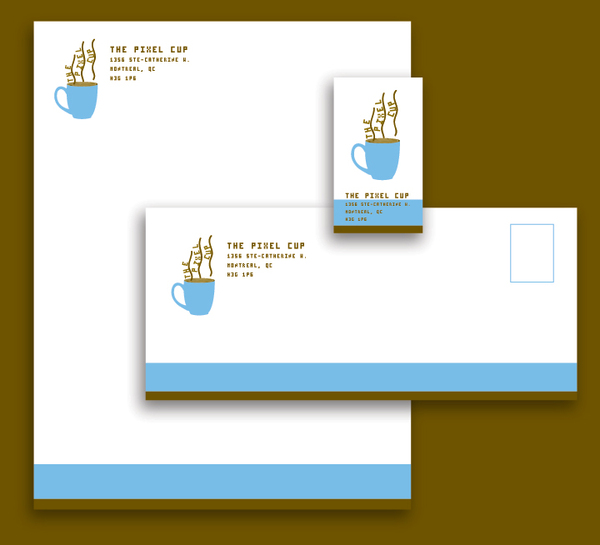
  • Needs to incorporate logo 
  • Needs Company Colors 
  • Typeface to reflect company 
  • Company name and address 
  • Contact name 
  • Phone numbers 
  • Fax numbers 
  • E-mail address 
Businesscard Research
Link1
Link2

Full Layout Research
Link1
Link2
Link3

I've taken several photos of various storefronts in Des Moines this past weekend, though they weren't quite in the right area, so I need to go and take different ones.

I've gone ahead and made templates in InDesign and/or Illustrator for the required components of the project.

Thursday, February 21, 2013

February 21:: P2 Brief WIP

Summary & Brief History: 'Furniture Store X’s mission is to provide easy and quick access to well-designed furniture traditionally found only in designer showrooms. FSX plans on being a one-stop source for modern design, from iconic mid-century works to innovative items designed today. FSX sells clean and simple furniture and accessories, representing designers, materials and processes that span categories and countries.'

Demographics (Age, Gender, Income, Employment, Geography & Lifestyle) of target audience:
  • Varied; 30s & upwards
  • Male & Female
  • Middle Class - Upper Class Incomes
  • Business & Design Professionals
  • United States nationwide
  • Stable Homes
  • FSX markets to businesses and design professionals, as well as the general public via a catalog, web site, and retail studios. In addition to residential settings, many of the items offered are used in corporate settings, restaurants, hotels and schools around the world. The Studios offer special services for architects and interior design professionals. Whether customers experience DWR by Studio, phone or online, they receive knowledgeable assistance from people who come from design backgrounds.
Competitive Landscape: Hive (add more in later from website list)

Business Objectives (Why the need for the project): Opening & advertising of a new store opening in downtown Des Moines Iowa

Message (what should be communicated): 
  • New store opening; 
  • 'provide easy and quick access to well-designed furniture traditionally found only in designer showrooms'
  • FSX ‘s goal is to be a leading retailer in well-designed furniture, accessories and services for businesses and design professionals. Its marketing strategy relies on the Internet and other direct marketing channels. This communication strategy will be the guiding factor in your approach to the system you design.
Call to Action (Context of Message in relation to what needs to be communicated): 
  • “The desire to deliver great products to a broader group of people and to elevate the interest in
    design, has been here since the Bauhaus. Our goal is simply to accelerate the way that design gets to the public and to take advantage of the most current technology in this process. In Europe, furniture design is taken more seriously and the public has greater access to well-designed products. By giving customers access to the best in modern design – including iconic works that have been in production since the mid-20th century as well as innovative items designed today – we made design within reach.”
Metrics for measuring success (what needs to be achieved): Advertise the opening of the new store in downtown Des Moines, to gain a wider consumer audience

Timeline:

Feb 19 - Feb 21: Research
Feb 26 - March 7: Creation/Concept
March 12 - March 14: Production (print)
March 14 - March 15: Turn in (booklet or panel form)

---

Project 2 Specifics:


1. A logo, letterhead, envelope and business card.
2. Promotional poster(s) for the store’s opening. (11 x 17; does not need full size for final turn in)
3. An exterior sign for the building based on your logo. 
  • (Present it as it would look in place on a building. You must select a suitable building in the East Village area for your store front. Photograph this building and use the photo to mock up your presentation in Photoshop.)
4. A small brochure/mailer that describes the business, provides contact information and promotes the store opening. (Tri-Fold Brochure)

February 21:: P2 Identity Systems

dwr.com
  • Red, Black, Light Grey color scheme
  • Sans-Serif
hivemodern.com
  • Yellow, Light Grey color scheme
  • Sans-Serif
allmodern.com
  • Green, Dark Grey color scheme
  • Sans-Serif
roomandboard.com
  • Black, Grey, Brown color scheme
  • Sans-Serif
zoetico.com
  • Black, Grey, Blue color scheme
  • Sans-Serif
thehumansolution.com
  • Red, Grey, Green color scheme
  • Sans-Serif
  • Use of Bold & Underline
  • *Not particularly eye pleasing
stardust.com
  • Orange/Yellow, Grey, Green color scheme
  • Sans-Serif
  • Use of Bold & Underline
lexmod.com
  • Black, Green, White color scheme
  • Sans-Serif
  • Use of Bold
instylemodern.com
  • Black, Green, Red color scheme
  • Sans-Serif
  • Use of all Caps
lumens.com
  • Black, Orange, Grey color scheme
  • Sans-Serif
  • Use of all Caps
yliving.com
  • Black, Orange/Yellow, Grey color scheme
  • Sans-Serif
ruksliving.com
  • Red, Grey, Black color scheme
  • Sans-Serif
switchmodern.com
  • Grey, Green color scheme
  • Sans-Serif
kardiel.com
  • Dark Grey, Light Grey, Green, color scheme
  • Sans-Serif
  • *Not particularly eye pleasing
---

Many of the color schemes from the websites I've gathered seem to have Grey or Black in common as a color choice. I believe this is due to legibility reasons, as well as for comfort of reading/browsing.

Tuesday, February 19, 2013

February 19-21:: P2 Research

Just jotting down a few URLs to look into more later on. I'll add more to this post when I have more time to look in depth at the identity systems of the different websites I've found.

dwr.com
hivemodern.com
allmodern.com
roomandboard.com
zoetico.com
thehumansolution.com
stardust.com
lexmod.com
instylemodern.com
lumens.com
yliving.com
ruksliving.com
switchmodern.com
kardiel.com

bonluxat.com
contemporaryfurniturewarehouse.com

Good reference for manufacturers for product images:

projectsfurniture.com/manufacturers

Monday, February 18, 2013

Posterheroes Final Poster


'I call my piece ‘Healthy Living’. My entry to the Posterheroes competition is centered on the idea of Health/Living. I chose to represent the healthy lifestyle and dietary education with a silhouette of a runner complete with many fruits and vegetables that I hand-rendered myself, and composed them as a backdrop to the figure. I decided to add the words ‘Live Well’ to help emphasize the ideas behind my piece, as I felt just the image itself wasn’t particularly clear enough on its own.'

This is my final piece that I submitted to the Posterheroes contest, the excerpt I included in submission, and proof that I submitted it on time.

I found the project fairly fun to complete. I ended up sketching around 15 different designs before I picked the final design to render more fully into a finished design. Drawing all the vegetables took more time that I originally anticipated, but I feel the effort was well worth it. I wish I had more time to play with the silhouette more, since I wasn't 100% happy with how it ended up, mostly around the hand still. It took a bit of effort to figure out how to get text to work properly in Illustrator, as I've mostly used text in InDesign or Photoshop.

Overall though, I found the project both challenging and fun since I was able to try out new things I haven't had a chance to try out on other projects thus far.

Final Critique Poster


This is the Poster I presented for the final critique in class on Thursday, February 14.

Some personal comments I had about my piece seeing it at full scale:
- Lighten Green BG
- Increase the size of the silhouette
- Poss. change the lineart color of the fruits/veggies
- Add a bit of text
- Adjust silhouette outline

Comments from others during critique:
- Possibly build the figure out of fruits/veggies
- Thin out silhouette's leg
- Add text 'Live Smart'?
- Possibly have fruit as the BG with a solid color silhouette
- Add text in the silhouette
- Make the silhouette green or black
- Use fruit/veggies to help define arms in silhouette

Poster Component WIPs


During the first group critique, I was still piecing together my poster, so I just discussed the components. Everyone seemed to be okay with where I was going with the ideas, however.

Monday, February 4, 2013

February 4:: P1 Finalized Idea & Synopsis

     
Project 1 is centered around the idea of a Smart City. Smart cities can be identified (and ranked) along six main axes or dimensions. These axes are: a smart economy; smart mobility; a smart environment; smart people; smart living; and, finally, smart governance. These six axes connect with traditional regional and neoclassical theories of urban growth and development. In particular, the axes are based - respectively - on theories of regional competitiveness, transport and ICT economics, natural resources, human and social capital, quality of life, and participation of citizens in the governance of cities.

A city can be defined as ‘smart’ when investments in human and social capital and traditional (transport) and modern (ICT) communication infrastructure fuel sustainable economic development and a high quality of life, with a wise management of natural resources, through participatory governance. (Reference)

My final idea for Project 1 is the Silhouette idea I had posted previously. I have re-drawn the sketch to be more crisp and defined, and referenced a running stock photo to make sure the anatomy was accurate. I made my own edits to the silhouette as well. I plan to fill the Silhouette of the running girl with popular vegetables and fruits from Italy. I am not sure what to do with the background at this point. I'm thinking a flat color, just not sure of what color yet.

The poster competition takes place around & in Italy, so I did research into Vegetables & Fruits from Italy. My list of common fruits & vegetables from Italy are in the post previous to this one. I will not retype/repost them for the sake of repeating myself too much. I haven't drawn all the vegetables I would like to include in my piece as of yet. I've only drawn a few to scan in and color digitally.